
Content with relevant images gets 94% more views than content without.
Design matters, whether you’re building a better website, sending thousands of pieces of mail, or creating an advertisement for social media. How do you catch a viewer’s eye with better images?
Our team has decades of experience in bringing the best results for clients. Our eye-catching creative work has won awards from the Direct Marketing Association of Washington. Want to learn how to design killer images from our experts? Keep reading.
1: Balance
What is balance and why does it matter? Balance is the weight distributed in the design by elements’ placement. Balance provides stability and structure to a design.
Visual balance is similar to balance in physics. A large shape close to the center of an image can be balanced by a small shape close to the edge. There are four basic types of balance: radial, symmetrical, asymmetrical, and mosaic balance. Consider weight and direction when
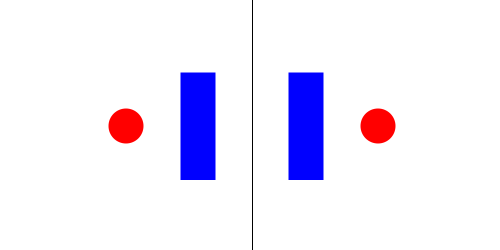
While there are many types of balance, one of the most popular in design is symmetrical balance, as displayed below.
Unbalanced images detract from a professional appearance. Using free grid tools in Photoshop, Canva, or other design tools can help contribute to the balance of an image.
2: Proximity
Proximity creates a relationship between elements of the image. While proximity does not mean that elements have to be placed together, it means they should be visually connected in some way. Below is an example of how proximity connects thematically similar elements.
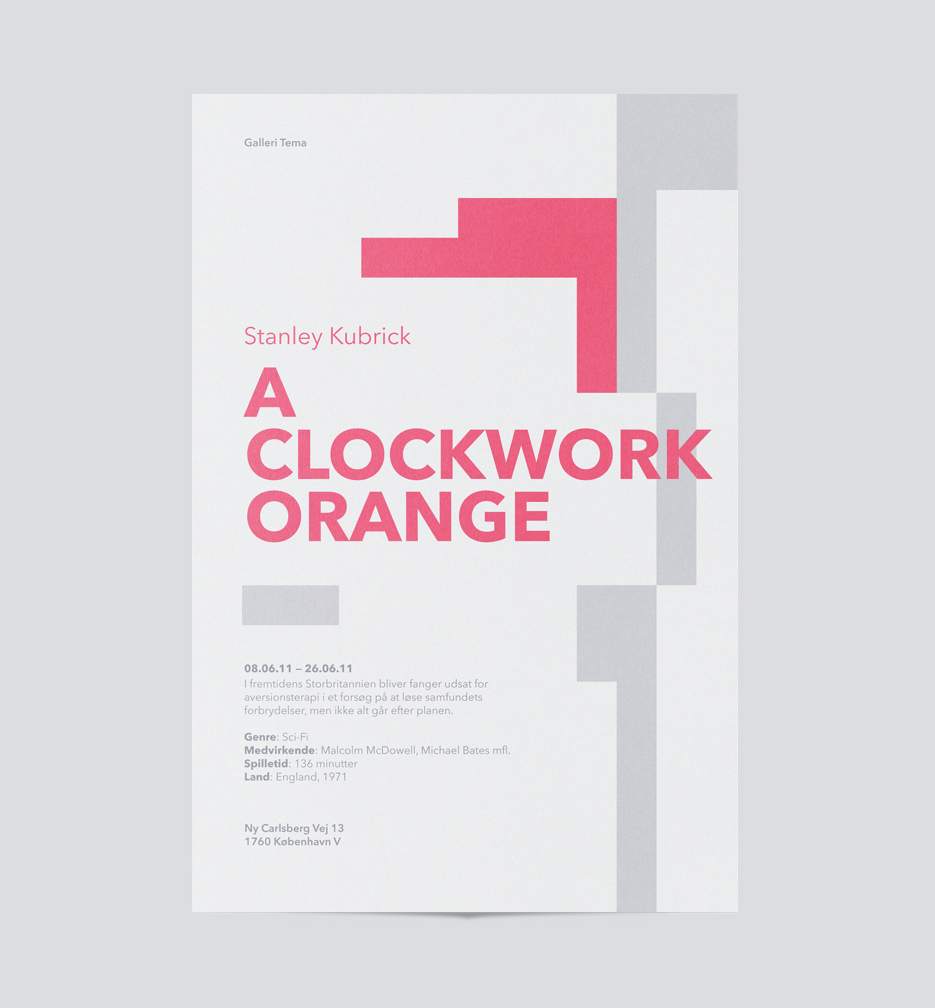
In the sample book cover design, the subtitles and other text are placed close to the title, but the font size means that the supplementary text does not conflict with the main part of the image. The proximity of the subtitle and other text ensures that it gets read, while its balance with the title ensures that it is not the focus.
3: Alignment
Alignment creates order and organization. Alignment creates visual connections between each of the elements. The principle behind aligning elements and putting them in proximity to each other is to create balance. Disparate elements that are scattered across an image can make it difficult to find and focus on the most important part of the image. Parallel or perpendicular elements create a sense of proportionality and please the eye.
4: Repetition
Repetition strengthens a design by tying together individual elements. Text, logo, and background image can feel disjoined unless repeating colors and similar themes. It helps to create association and consistency. Repetition can create rhythm — a feeling of organized movement.
A Coca Cola ad demonstrates the power of simple, strategic repetition of elements.

5: Contrast
Contrast juxtaposes opposing elements. One way of using contrast is to incorporate opposite colors on the color wheel into the design. Using opposing colors makes the text stand out from the rest of the design for the best results.
Another way to use contrast in a design is to emphasize the differences between light and dark values in an image. Distinguish various lines and colors from each other by increasing the distinction between light and shadow.
Directional contrast also differentiates between key elements of an image: vertical and horizontal contrast can be a beautiful way to emphasize sparingly. Contrast allows us to emphasize or highlight key elements in your design.
6: Space
Space in art refers to the distance or area between, around, above, below, or within elements. Maintaining space between elements helps focus the eye and avoid overwhelming a viewer with too much input. Both positive and negative space are important factors to be considered in every design.
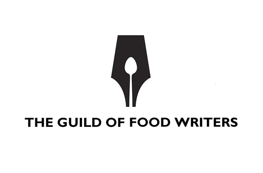
Negative space emphasizes the visual elements that matter most. Often negative space is used to further a minimalistic design for maximum impact. The Guild of Food Writers’ logo illustrates the clever use of negative space to include both a pen and a spoon, incorporating their mission with minimal distraction.
Rather than cramming multiple messages into a single image, whittle the idea down to the essential copy and design elements. Avoiding clutter creates a crisper, more visually-appealing image that can convert viewers into customers.
By mastering the 6 essential elements of design, your business or organization can better capture a viewer’s attention — and maybe their business as well. And remember to give us a call if you are interested in a design consultation! We are happy to help with your art needs.
By Esther Grace Ehrenman, Digital Editor and Strategist, and James Rollins, Art Director
Sources
1: Edgee
2: Smashing Magazine
3: Main Street Host
Stay tuned! Soon, we are publishing a digital marketing white paper. It contains the numbers, the philosophy, and the how-tos on all facets of digital marketing. To keep up, subscribe to our email list.